Themes: Dialog
This sets the theme for dialogs and is used to stylize scripted messages (i.e. an application message box (VBA extension MsgBox) or add attention to a specific area of an app. Note that this element is only available in Themes and is not a graphical control in the application designer.
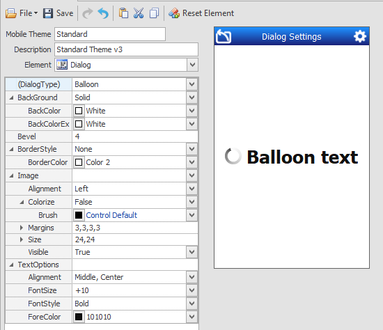
(Dialog Type) - Globally sets the shape of the dialog when a dialog is used in an application at runtime. The types are: Balloon, Error, Information, Input, Question, ToolTip, and Warning.
If ToolTip is selected, the LeftSlope and RightSlope properties are added so you can shape the tail of the ToolTip.
Image - The image that displays in the dialog are built-in examples, but can changed to the image selected from the Image drop down list. For example, if Dialog Type is Balloon, an animated spinner displays. But if a value is entered in the Image property, that image will be used. To recover the default icons, tap the Reset Element button.
You can set one type per a theme and then stylize it, but a variety of dialogs (i.e. Balloon and Error) are not supported within the same theme. The selected dialog type can be customized when you change the properties.
BorderStyle - If you want the dialog to have a tail select the ToolTip option. Otherwise, all the other borderstyles are the same as in other controls.
The rest of the properties are used in the same way as the other controls.
For more details, see Graphical Control Properties.
Note: The Buttons Property Group was removed in 5.2.4.3. Buttons - sets the graphical property settings for the buttons used in the Diaglog box.
The Title property was also removed in 5.2.4.3.